
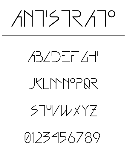
This Postscript font was created from an art deco inspired hand-lettering style I created in the mid-80's for the covers of my mix tapes. Since I was rather emphatic and mechanistic in those days, I created only the majescule font and numbers, and left out the punctuation marks. Actually the real reason for the lack of all the other stuff was that this font was entirely hand-coded in Postscript, and it's a hella load of work.
Effort notwithstanding, one day I'll return to this font to sort out the kerning and flesh it out fully, but for now it will just have to do as is.

This logo was developed for a fun little site filled with blasphemy and abominations.
Design work was done by hand-coding a SVG file until it was just right. I started by reproducing an Otl Aicher generic figure, and added a head clamp with just enough detail to convey the predicament of anyone unfortunate enough to be stuck with a really lousy piece of technology.
<?xml version="1.0" standalone="no"?>
<svg xmlns:svg="http://www.w3.org/2000/svg"
xmlns="http://www.w3.org/2000/svg"
version="1.0" width="240" height="535"
viewBox="0 0 240 535">
<title>Man icon</title>
<g fill="#000000" stroke="none">
<circle cx="115" cy="95" r="37"/>
<path d="M200,300
v-115
c0,-24,-19,-49,-48,-49
h-74
c-29,0,-48,25,-48,49
v115
c0,22,32,22,30,0
v-106
h8
v291
c0,30,43,30,43,0
v-169
h6
v169
c1,30,43,30,43,0
v-291
h8
v106
c0,22,32,22,32,0Z"/>
<path d="M200,80
v-35
c0,-10,-10,-20,-20,-20
h-130
c-10,0,-20,10,-20,20
v40
c0,10,10,20,20,20
h10
c5,0,10,5,10,10
h5
v-40
h-5
c0,15,-20,15,-20,0
v-20
c0,-5,5,-10,10,-10
h110
c5,0,10,5,10,10
v25
h-5
v5
h-5
c-5,0,-10,-5,-10,-10
h-5
v40
h5
c0,-5,5,-10,10,-10
h5
v5
h30
v-5
h5
v30
h10
v-30
h5
v-20
h-5
v-30
h-10
v30
h-5
v-5
h-5
Z"/>
</g>
</svg>
When Gene Café at Kingsway and Main opened they didn't have a logo — and when they got one I didn't like it... so I set to making a better one.
Since the café was named after Gene, the building's long-time maintenance man, and the building dates from the time of flathead screws and square nuts, I incorporated old-time hardware motifs as a tribute to Gene's hard work over the years, and to the building's heritage character. These were incorporated into a clean, modern matrix based on an extremely abstracted coffee bean. The surfeit of whitespace between glyphs reflects the café's monochromatic-minimalist interior decor.
All work from concept to finished image file was done with the GIMP, an open-source image application

When my friends started a home business making baby wraps and slings, I was asked to come up with a logo. After settling on the name Island Bird City Bird, the idea of two birds seemed to fit the concept perfectly.
The rotationally symmetrical design is intended to not only resemble baby birds cozy in their nest, but also to reflect the gentle angle of a baby held in one's arms. The meeting of the beaks invokes the nurturing act of the mother bird feeding it's young.
The original design was developed as a pencil sketch. Once the essence had been established, it was replicated in Inkscape as a vector graphic for maximum flexibility. Various forms, including fills, outlines, and positive-negative arrangements were tried, with the above as the final result. Since this was created as a vector image composed of simple geometric forms, it is possible to easily scale it or modify the colours or details for any purpose or context required.

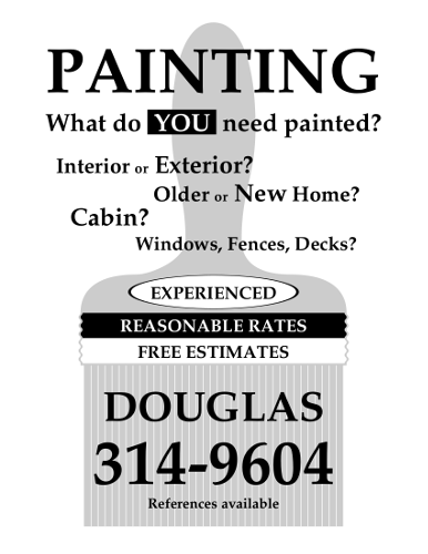
A client wanted to promote his house-painting business, so I created a poster and business card with a simple, consistent and unmistakable character. The strong monochrome design is recognizable from a distance on the street, while also minimizing reproduction costs by allowing him to use a commodity printer or cheap printing service. The poster was intended to be printed on day-glow yellow, orange and green paper for maximum visibility. These promotional materials enabled Doug to expand his customer base and attract enough business to keep him painting full-time.
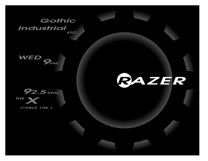
Between 2000 and 2003, my friend and I hosted a weekly industrial/gothic radio programme on CFBX 92.5FM, the college & community radio station at Thompson Rivers University in Kamloops, B.C. Since the station was virtually unknown, even on campus, I produced a variety of small posters to pin up wherever I could.
The poster above reflects the character of our show: dark as night, lit only by the glow of machines. Information is restricted to the bare minimum required to identify and access the programme. The layout and typography were closely matched to those employed in official artwork of several gothic industrial bands that are identified strongly with the aesthetic from which we drew our selections.
The dominant cog motif is commonly associated with the industrial genre. It visually represents the cyclical and repetitive nature of the music, as well as the mechanistic, inhuman nature of industrialization, to which industrial music is a reaction.
This poster was produced by a manually constructed Postscript program. The original file below includes code to print 4 posters on a US Letter page.
| %!PS
| % 118551744 derived from 117100030
| % poster for 2002 fall semester
|
| /cog {  %developed on a 1000x1000 grid
| newpath
| 990 500 moveto 			%cog outside
| 0 30 330 {
| 500 500 490 3 index dup 6 add arc
| dup 9 add
| 500 500 420 3 index dup 12 add arc
| dup 15 add
| 500 500 490 3 index dup 6 add arc
| pop pop pop
| } for
| 820 500 moveto				%cog inside
| 500 500 320 0 360 arc
| } def
|
| /wordup { gsave moveto 1.5 0.7 scale show grestore } def
|
| /unit {
| gsave
| rat dup scale
| %  0 0 610 790 rectstroke	% shows outline of each unit
|
| 610 0 translate 90 rotate
| 0 0 790 610 rectfill
| gsave
| 180 0 translate
| gsave
| 305 305 translate
| 300 -1 260 {
| dup 0 moveto dup 0 0 3 2 roll 0 360 arc
| 260 sub neg 30 add 100 div setgray fill
| } for
| 200 -1 160 {
| dup 0 moveto dup 0 0 3 2 roll 0 360 arc
| 160 sub 120 div setgray fill
| } for
| grestore
| .61 dup scale cog 0 setgray eofill
| grestore
| gsave 1 setgray 485 305 30 0 360 arc fill grestore
|
| /AvantGarde-DemiOblique findfont 60 scalefont setfont
| 0 setgray
| (R) 452 288 wordup
| 1 setgray
| 3 0 (AZER) 469 (R) stringwidth pop add 288
| gsave moveto 1.5 0.7 scale ashow grestore
|
| /AvantGarde-DemiOblique findfont 30 scalefont setfont
| 0.5 setgray
| (Gothic) 140 540 wordup
| (Industrial) 50 510 wordup
| (WED) 50 390 wordup
| (2.5) 102 250 wordup
|
| /AvantGarde-DemiOblique findfont 40 scalefont setfont
| (9) 150 370 wordup
| (9) 70 250 wordup
|
| /AvantGarde-DemiOblique findfont 50 scalefont setfont
| (X) 80 210 wordup
|
| /AvantGarde-DemiOblique findfont 15 scalefont setfont
| (MHz) 170 250 wordup
| (PM) 180 370 wordup
| (THE) 40 228 wordup
| (CABLE 106.1) 60 190 wordup
| (ETC.) 250 495 wordup
| grestore
| } def
|
| /grid {
| 305 0 moveto 0 hmod rlineto stroke 303
| hmod moveto 4 0 rlineto stroke			% bottom t
| 305 790 moveto 0 hmod neg rlineto stroke 303 790
| hmod sub moveto 4 0 rlineto stroke	% top t
| 0 395 moveto 20 0 rlineto stroke 20 393 moveto
| 0 4 rlineto stroke			% left t
| 610 395 moveto -20 0 rlineto stroke 590 393 moveto
| 0 4 rlineto stroke			% right t
| 303 395 moveto 4 0 rlineto stroke 305 393 moveto
| 0 4 rlineto stroke			% centre mark
| } def
|
| %%%
|
| /init {
| /rat 570 610 div def
| /hite 790 rat mul def
| /hmod 790 hite sub 2 div def
| /wide 610 rat mul def
| } def % end init
|
| /page4 {
| init
| grid
| 0.5 dup scale 610 790 translate
| gsave wide neg hite neg translate unit grestore
| gsave 0 hite neg translate unit grestore
| gsave wide neg 0 translate unit grestore
| gsave unit grestore
| } def %end page4
|
| /page1 {
| init
| 20 20 translate unit
| } def
|
| page1
|
| showpage
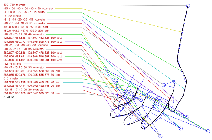
Postscript programming is a challenging pursuit, especially when undertaken without the aid of modern interactive vector manipulation tools. In order to make sense of complex works, I created a library to visually enhance the work-in-progress with run-time annotation.
In this rendering of a Postscript document, the subject is a line drawing of a hand, related visually to the builtin commands that generate it. This is accomplished by using a set of proxy commands that enhance the builtin commands. As each proxy command is executed, the builtin command is printed to the side and a line is generated to connect the statement with the path segment produced by it. Additionally, arcs are enhanced with visual elements indicating their centre, sweep, and a dotted line connecting beginning and end. The coloured connector lines and displayed statements are produced and laid out programmatically, requiring no intervention on the part of the designer. Once the drawing is completed, the proxy commands respond to an in-code which disables the metainformation display for final presentation purposes.
The PDF file presented here was converted from my hand-coded Postscript programs for the sake of portability.